Olympics Mexico 1968
Poster:
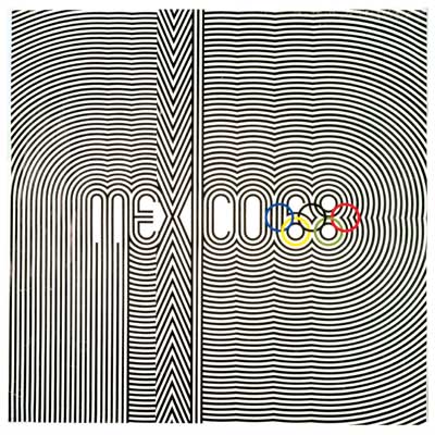
The 1968 Olympics poster used line in pattern and repetition to create a striking visual. The lines are all the same weight and distance apart and the repetition makes it seem like it's vibrating. The poster is simple in essence but looks more complicated in the use of repetition.
A number of other posters were created and designed by New York Designer Lance Wyman. he used the 60's Op-Art Typography that set the tone for all the other various posters.
the logo has been compared to the London 2012 logo for there legibility
they are very different in the way 1968 is very balanced and bolder in colour, the london logo is a jumble of shapes and colours and is dynamic with all straight lines as opposed to all curved lines of Mexico's logo.
Eagles logo
The eagles poster is dynamic in the way the eagle is flying diagonally through the image. the only colours used are the team colours and they are effective in creating hierarchy in the strength of the typography for example the black is stronger than the blue. The black also allows the detail to be more visible for example in the feathers. the word 2006 Premiers are made very visible in bold uppercase and black colour.
14/45 NYC Please complete 'Museum Critiques', 'Art Vocab List', 'Adjective List' and 'Elements and Principles' Posts ... ASAP
ReplyDelete