Monday, 22 October 2012
agideas
A trend i noticed at AGIDEAS was that they rally incourage "collaboration". Many designers at agideas have collaborated with others to give them a really ad,
Sunday, 15 April 2012
Fonts
www.youworkforthem.com
YWFT Wellsworth
This Font is decretive and fits well in a logo as there examples show
YWFT Wellsworth is the lovechild of that wayward 70s Julia Script and a massive-shouldered fellow with a big black beard and a laugh that rolls like thunder. Formerly known as a handset only design, YWFT Wellsworth is now a powerful, swashbuckling OpenType.
Ryder Gothic Pro
This font is simple and tall and condensed giving it a clean professional look
Designed by Steve Jackaman & Ashley Muir. A revival based on the Harry Winters design 'Roslyn Gothic' released by VGC in 1972. We've added a new light weight and several alternate glyphs.
Retro
This Font has sharp corners thats aggressive and suit the team, and it is bold and legible
This all capital, slab serif typeface was inspired by elements of early 20th century Constructivist, Bauhaus, Art Deco and Streamline graphic movements.
Terms & Conditions
You can purchase fonts from the website by registering with an email address and password.
http://www.youworkforthem.com/font-license
http://www.youworkforthem.com/font-license
Stock Images
Images From
http://www.shutterstock.comImage 1-
This image is strong and has enough negative space to easily place the logo so it will stand out.
Image 2-
This image would be great for demonstrating the team uniform
Image 3-
This is a billboard in a city environment which could represent the city my team is in.
Terms & Conditions
At shutter stock you can subscribe to download images or browse the website and buy images that interest you. There are subscriptions that go go from 1 month to 1 year that have a rule of 25 images a day.
single user standard licence
single user enhanced licence

Friday, 23 March 2012

Tuesday, 13 March 2012
Native American Motifs
Golden State Warriors
There logo from 1946-1962 depicted a native american character in a cartoon style, it looks childish and the character is only wearing a feather and shorts. They changed there logo when they moved from Philadelphia to San Francisco to the golden gate bridge, but they then went back to the feather point in a newer version which they have again changed back to the bridge. in my opinion you can't tell it is native american in the newer one they changed.
There logo from 1946-1962 depicted a native american character in a cartoon style, it looks childish and the character is only wearing a feather and shorts. They changed there logo when they moved from Philadelphia to San Francisco to the golden gate bridge, but they then went back to the feather point in a newer version which they have again changed back to the bridge. in my opinion you can't tell it is native american in the newer one they changed.
Monday, 12 March 2012
Aboriginal Motifs
Functions and Philosophies
1. Secrecy and confidentiality- if the work contains certain aboriginal customs to respect indigenous religious practices is can be disclosed.
The use of names and images and sometimes artwork of deceased indigenous people is not permitted by many indigenous communities.
2. Indigenous control- the process of obtaining consent for use of artwork goes in steps
Moral Rights and issues
1. Secrecy and confidentiality- if the work contains certain aboriginal customs to respect indigenous religious practices is can be disclosed.
The use of names and images and sometimes artwork of deceased indigenous people is not permitted by many indigenous communities.
2. Indigenous control- the process of obtaining consent for use of artwork goes in steps
- allow time to communicate the request
- allow time for the decision to be made
- there are many cultural aspects for them to consider
- usually no is the answer
- respect there views
Moral Rights and issues
- the right attributed as the artist
- the right not to have work falsely attributed to another artist
- the rights of integrity
Tuesday, 6 March 2012
Clash of the Titans
1) Who are the Titans?
The Titans are gigantic creatures descending of Gaia and Uranus, that ruled during the legendary Golden Age. Although it is mentioned in the beginning of the movie that Hades created them to overthrow Zeus.
2)Are there any interesting motifs you see frequently appearing (Eg. Lightning bolts)? How do you interpret their meaning? Can you name a modern version, of this motif, used today?
The lightning bolts appeared regularly as help from above from Zeus. a modern day use of the lightning bolt would be on sports drinks such as gatorade and sports teams such as warriors (nba).
The lightning bolts appeared regularly as help from above from Zeus. a modern day use of the lightning bolt would be on sports drinks such as gatorade and sports teams such as warriors (nba).
3) Is your Greek character in the movie? If so, does the film’s interpretation match your research?
No, Hercules was a no show.
4) Are any of the characters, in the movie, related (Eg. a mother or father, wife or husband, brother or sister) to your Greek myth? If so, how?
Hercules father Zues and half brother Percius are mentioned.
Hercules father Zues and half brother Percius are mentioned.
5) Is their a constellation of stars named after your Greek character?
Hercules is a constellation named after Hercules. Hercules is one of the 48 constellations listed by the 2nd century astronomer Ptolemy, and it remains one of the 88 modern constellations today. It is the fifth largest of the modern constellations.
Hercules is a constellation named after Hercules. Hercules is one of the 48 constellations listed by the 2nd century astronomer Ptolemy, and it remains one of the 88 modern constellations today. It is the fifth largest of the modern constellations.
6) How is Medusa killed? Does your Greek character have a weakness?
Perseus cut her head off by looking at the reflection in his shield and closing his eyes spinning around and decapitating her. Hercules can be lustful and gluttonous.
7) Sketch at least 3 ideas for your logo and add them to this post.
Perseus cut her head off by looking at the reflection in his shield and closing his eyes spinning around and decapitating her. Hercules can be lustful and gluttonous.
7) Sketch at least 3 ideas for your logo and add them to this post.


Tuesday, 28 February 2012
Melbourne Sports Museum Critiques
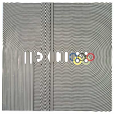
Olympics Mexico 1968
Poster:
The 1968 Olympics poster used line in pattern and repetition to create a striking visual. The lines are all the same weight and distance apart and the repetition makes it seem like it's vibrating. The poster is simple in essence but looks more complicated in the use of repetition.
A number of other posters were created and designed by New York Designer Lance Wyman. he used the 60's Op-Art Typography that set the tone for all the other various posters.
the logo has been compared to the London 2012 logo for there legibility
they are very different in the way 1968 is very balanced and bolder in colour, the london logo is a jumble of shapes and colours and is dynamic with all straight lines as opposed to all curved lines of Mexico's logo.
Eagles logo
The eagles poster is dynamic in the way the eagle is flying diagonally through the image. the only colours used are the team colours and they are effective in creating hierarchy in the strength of the typography for example the black is stronger than the blue. The black also allows the detail to be more visible for example in the feathers. the word 2006 Premiers are made very visible in bold uppercase and black colour.
Critiquing Tools
Art Vocabulary
Assemblage
art made by combining a collection of three‑dimensional objects into a whole. It can either be a free‑standing sculpture or be mounted on a panel, and it is usually made from scraps, junk, or various manufactured or natural objects.
Aesthetic
pertaining to the artistic and beautiful; a perception that something pleases the eye.
Motif
element or
combination of elements repeated often enough in a composition to become a
dominant feature.
Atmospheric perspective
way of showing depth and distance in a painting by using fading colors and hazy details to indicate objects in the distance.
Fresco
painting done with water‑based paint on fresh plaster so that as it dries the colors are absorbed into the wall.
way of showing depth and distance in a painting by using fading colors and hazy details to indicate objects in the distance.
Fresco
painting done with water‑based paint on fresh plaster so that as it dries the colors are absorbed into the wall.
Adjectives
Abstract
eclectic
Selecting or employing individual elements from a variety of sources, systems, or styles: an eclectic taste in music; an eclectic approach to managing the economy.
Made up of or combining elements from a variety of sources: “a popular bar patronized by an eclectic collection of artists, writers, secretaries and aging soldiers on reserve duty” (Curtis Wilkie).
Gothic architectural style developed in western Europe from the 1100s to the 1400s, characterized by pointed arches, tall buildings with thin walls and large stained glass windows, and airy interior space.
intensity
relative
brightness or dullness of a color.
Bibliography
http://www.thefreedictionary.com/eclectic
www.globaled.org/chinaproject/.../chineseart/Lesson1Glossary2.doc
Principles and Elements of Design Principles:
|
LINE
Line can be considered in two ways. The linear marks made with a pen or brush or the edge created when two shapes meet.
SHAPE
A shape is a self contained defined area of geometric or organic form. A positive shape in a painting automatically creates a negative shape.
DIRECTION
All lines have direction - Horizontal, Vertical or Oblique. Horizontal suggests calmness, stability and tranquillity. Vertical gives a feeling of balance, formality and alertness. Oblique suggests movement and action
SIZE
Size is simply the relationship of the area occupied by one shape to that of another.
TEXTURE
Texture is the surface quality of a shape - rough, smooth, soft hard glossy etc. Texture can be physical (tactile) or visual. Elements:
Bibliography
|
Conceptual art
Conceptual art is an artists interpretation of a concept usually for moving image movies for example. The concept(s) or idea(s) involved may be constructed by anyone simply by following a set of written instructions.
conceptual artists include Joseph Kosuth, Lawrence Weiner
image of Conceptual art
http://upload.wikimedia.org/wikipedia/en/2/2d/Kosuth_OneAndThreeChairs.jpg
Bibliography
http://en.wikipedia.org/wiki/Conceptual_Art
conceptual artists include Joseph Kosuth, Lawrence Weiner
image of Conceptual art
http://upload.wikimedia.org/wikipedia/en/2/2d/Kosuth_OneAndThreeChairs.jpg
Bibliography
http://en.wikipedia.org/wiki/Conceptual_Art
Magic realism
Magic realism or magical realism is an aesthetic style or genre of fiction in which magical elements blend with the real world. Magic realism a term used by American painters such as Ivan Albright, Paul Cadmus, George Tooker and other artists during the 1940s and 1950s.
image of Magic realism
http://upload.wikimedia.org/wikipedia/en/1/1f/PaulCadmusTheFleetsIn.jpg
Bibliography
http://en.wikipedia.org/wiki/Magic_Realism
image of Magic realism
http://upload.wikimedia.org/wikipedia/en/1/1f/PaulCadmusTheFleetsIn.jpg
Bibliography
http://en.wikipedia.org/wiki/Magic_Realism
Cubism
Cubism is a 20th century art movement, pioneered by Pablo Picasso and Georges Braque. In cubist artworks, objects are broken up, analyzed, and re-assembled in an abstracted form—instead of depicting objects from one viewpoint, the artist depicts the subject from a multitude of viewpoints.
image of Cubism
http://upload.wikimedia.org/wikipedia/en/d/d1/Picasso_three_musicians_moma_2006.jpg
Bibliography
http://en.wikipedia.org/wiki/Cubism
image of Cubism
http://upload.wikimedia.org/wikipedia/en/d/d1/Picasso_three_musicians_moma_2006.jpg
Bibliography
http://en.wikipedia.org/wiki/Cubism
Suprematism
Suprematism was an art movement focused on fundamental geometric shapes like squares and circles. It started in Russia in 1915-1916. It was founded by Kasimir Malevich.
Artists include Aleksandra Ekster, Olga Rozanova, Nadezhda Udaltsova, Ivan Kliun, Liubov Popova.
image of Suprematism
http://upload.wikimedia.org/wikipedia/commons/6/6c/Malevici06.jpg
Bibliography
http://en.wikipedia.org/wiki/Suprematism
Artists include Aleksandra Ekster, Olga Rozanova, Nadezhda Udaltsova, Ivan Kliun, Liubov Popova.
image of Suprematism
http://upload.wikimedia.org/wikipedia/commons/6/6c/Malevici06.jpg
Bibliography
http://en.wikipedia.org/wiki/Suprematism
Futurism
Futurism was an artistic and social movement that originated in Italy in the early 20th century. It emphasized and glorified themes associated with contemporary concepts of the future, including speed, technology, youth and violence, and objects such as the car, the airplane and the industrial city.
Key figures of the movement include the Italians Filippo Tommaso Marinetti, Umberto Boccioni, Carlo Carrà, Gino Severini, Giacomo Balla, Antonio Sant'Elia, Tullio Crali and Luigi Russolo.
image of Futurism
http://upload.wikimedia.org/wikipedia/commons/f/fe/Umberto_Boccioni_001.jpg
Bibliography
http://en.wikipedia.org/wiki/Futurism
Romanticism
Romanticism (or the Romantic era/Period) was an artistic, literary, and intellectual movement that originated in the second half of the 18th century in Europe and strengthened in reaction to the Industrial Revolution. It was embodied most strongly in the visual arts, music, and literature, but had a major impact on historiography, education and natural history.
Artists include J.M.W. Turner, Francisco Goya, Théodore Géricault and Eugène Delacroix.
image of Romanticism
http://upload.wikimedia.org/wikipedia/commons/a/a7/Eugène_Delacroix_-_La_liberté_guidant_le_peuple.jpg
Bibliography
http://en.wikipedia.org/wiki/Romanticism
Artists include J.M.W. Turner, Francisco Goya, Théodore Géricault and Eugène Delacroix.
image of Romanticism
http://upload.wikimedia.org/wikipedia/commons/a/a7/Eugène_Delacroix_-_La_liberté_guidant_le_peuple.jpg
Bibliography
http://en.wikipedia.org/wiki/Romanticism
Bauhaus
Bauhaus, was a school in Germany that combined crafts and the fine arts, and was famous for the approach to design that it publicized and taught. It operated from 1919 to 1933. The buildings put up and decorated by the school's professors (Walter Gropius, Hannes Meyer, Laszlo Moholy-Nagy and Wassily Kandinsky) launched the Modern Movement, which shaped much of the architecture of the 20th century.
image of Bauhaus
http://anneserdesign.com/Bauhaus_1.jpg
image of Bauhaus
http://anneserdesign.com/Bauhaus_1.jpg
Bibliography
Art deco
Art deco, or deco, is an eclectic artistic and design style that began in Paris in the 1920s and flourished internationally throughout the 1930s and into the World War II era. The structure of Art Deco is based on mathematical geometric shapes. Art deco experienced a decline in popularity during the late 1930s and early 1940s, but had a resurgence during the 1960s
Founders included Hector Guimard, Eugène Grasset, Raoul Lachenal, Paul Bellot, Maurice Dufrêne, and Emile Decoeur
image of Art Deco
http://upload.wikimedia.org/wikipedia/en/9/9f/Lempicka_musician.jpg
Founders included Hector Guimard, Eugène Grasset, Raoul Lachenal, Paul Bellot, Maurice Dufrêne, and Emile Decoeur
image of Art Deco
http://upload.wikimedia.org/wikipedia/en/9/9f/Lempicka_musician.jpg
Bibliography
Symbolism
Symbolism was a late nineteenth-century art movement of French, Russian and Belgian origin in poetry and other arts.
The symbolist painters used mythological and dream imagery.In painting, symbolism was a continuation of some mystical tendencies in the Romantic tradition, which included such artists as Caspar David Friedrich, Fernand Khnopff and John Henry Fuseli.
Developed during the 1860s and '70s
The symbolist painters used mythological and dream imagery.In painting, symbolism was a continuation of some mystical tendencies in the Romantic tradition, which included such artists as Caspar David Friedrich, Fernand Khnopff and John Henry Fuseli.
Developed during the 1860s and '70s
image of Symbolism
http://upload.wikimedia.org/wikipedia/commons/3/30/The_Death_of_the_Grave_Digger.jpg
Bibliography
http://en.wikipedia.org/wiki/Symbolism_(arts)#Symbolist_visual_artists
Monday, 20 February 2012
Synchromism
Synchromism is based on the idea that color and sound are similar phenomena, and that the colors in a painting can be orchestrated in the same harmonious way that a composer arranges notes in a symphony.
From 1911 to 1913, they studied under the Canadian painter Percyval Tudor-Hart.
image of Synchromism
Other American painters who experimented with Synchromism include Thomas Hart Benton, Andrew Dasburg, Patrick Henry Bruce, and Albert Henry Krehbiel.
Bibliography
Tuesday, 14 February 2012
Hercules Hercules Hercules
Hercules was the Roman name for the greatest hero of Greek mythology (Heracles). Heracles had a god as one of his parents, being the son of the Zeus and a mortal woman. Zeus's queen Hera was jealous of Heracles, and when he was still an infant she sent two snakes to kill him in his crib. Heracles was found prattling delighted baby talk, a strangled serpent in each hand.
When he had come of age and already proved himself a marksman with a bow and arrow, a champion wrestler and the possessor of superhuman strength, Heracles was driven mad by Hera. In a frenzy, he killed his own children. To atone for this crime, he was sentenced to perform a series of tasks, or "Labors", for his cousin Eurystheus, the king of Tiryns and Mycenae. By rights, Hercules should have been king himself, but Hera had tricked her husband Zeus into crowning Eurystheus instead.
Hercules appearence handsome strong, musculer
Bibliography
http://www.mythweb.com/hercules/herc01.html
Monday, 6 February 2012
My goals
I want to further my skills this year. i want to create some really good folio pieces put in the effort to be unique and more versitile. i really want to get a job at a design studio. strengthen my style that ive begun to discover. be more confident in design choices.
Subscribe to:
Posts (Atom)